BRANDING
Preferred Pediatrics
A dynamic mom team that came together to provide amazing pediatric urgent care for their community.

Two things that come to mind when you meet this incredible duo: spirit and smarts. Needing immediate urgent care for a child can be scary.
They wanted a brand that not only put minds at ease but also appealed strongly to children. They truly know how to connect with their patients and we wanted to reflect that in their key messages.
From font choices to color palette - their brand truly resonates with parents and children alike.
LOGO
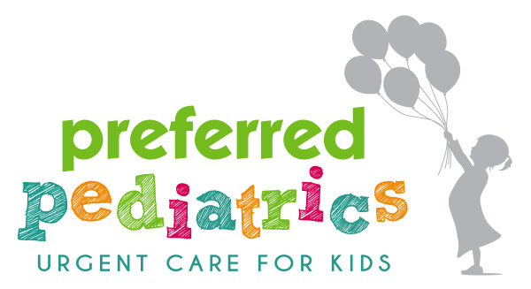
I developed the Preferred Pediatrics logo based off the owners’ personality while trying to bring something unique to their area. It is designed to feel whimsical and carefree. The owner’s daughter even makes an appearance!
The balloons symbolize youth, assurance, and familiarity. In addition, a balloon icon is used as a simple design element in other marketing pieces.
The font treatment is a mix of two styles of block lettering: clean and scribbled - intended to reflect a caring doctor/patient relationship.


COLOR PALETTE
The primary colors were chosen because of their well-known soothing and healing influence on the mind and body. The secondary colors are friendly and happy and highly recommended for urgent care units and hospitals, particularly children’s facilities.


