
REBRAND
Sustainability Solutions
A retrofit company in need of a fresh look to keep their brand current.


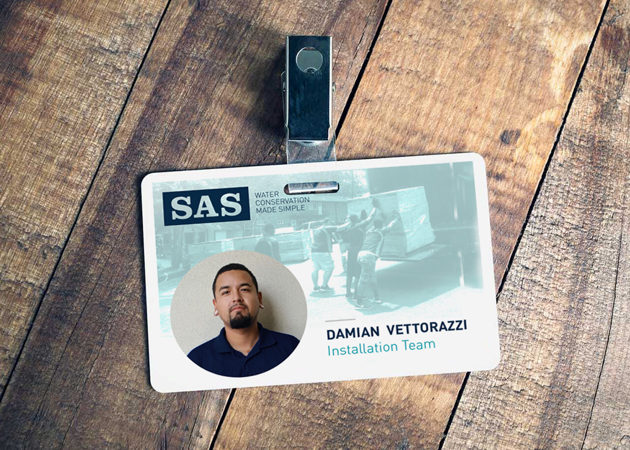
Sustainability Solutions (known more commonly as '“SAS”) is one of the original companies that specialize in retrofitting multifamily properties to lower their water and operating expenses. Yet, their outdated look and old messaging strategy was missing the mark. They needed fresh ideas that would keep their brand current and energetic to appeal to new customers without alienating the existing audience, thus driving long-term growth.
Our goal was to creatively and visually position the company’s strategy, refine their basic messaging, and improve the sales tools they used daily. The results were an updated visual identity with direct messaging that resonated more deeply with their intended target audience. A new website and proposal tools also helped create efficiencies in obtaining new customers.


LOGO


COLOR PALETTE
I pulled inspiration for the new color palette from the water cycle: under water, evaporation, and clouds. Because I like the meaning of colors to connect with the company itself, I choose four that not only complement each other, but is fitting with the company’s mission and vision.

PATTERN
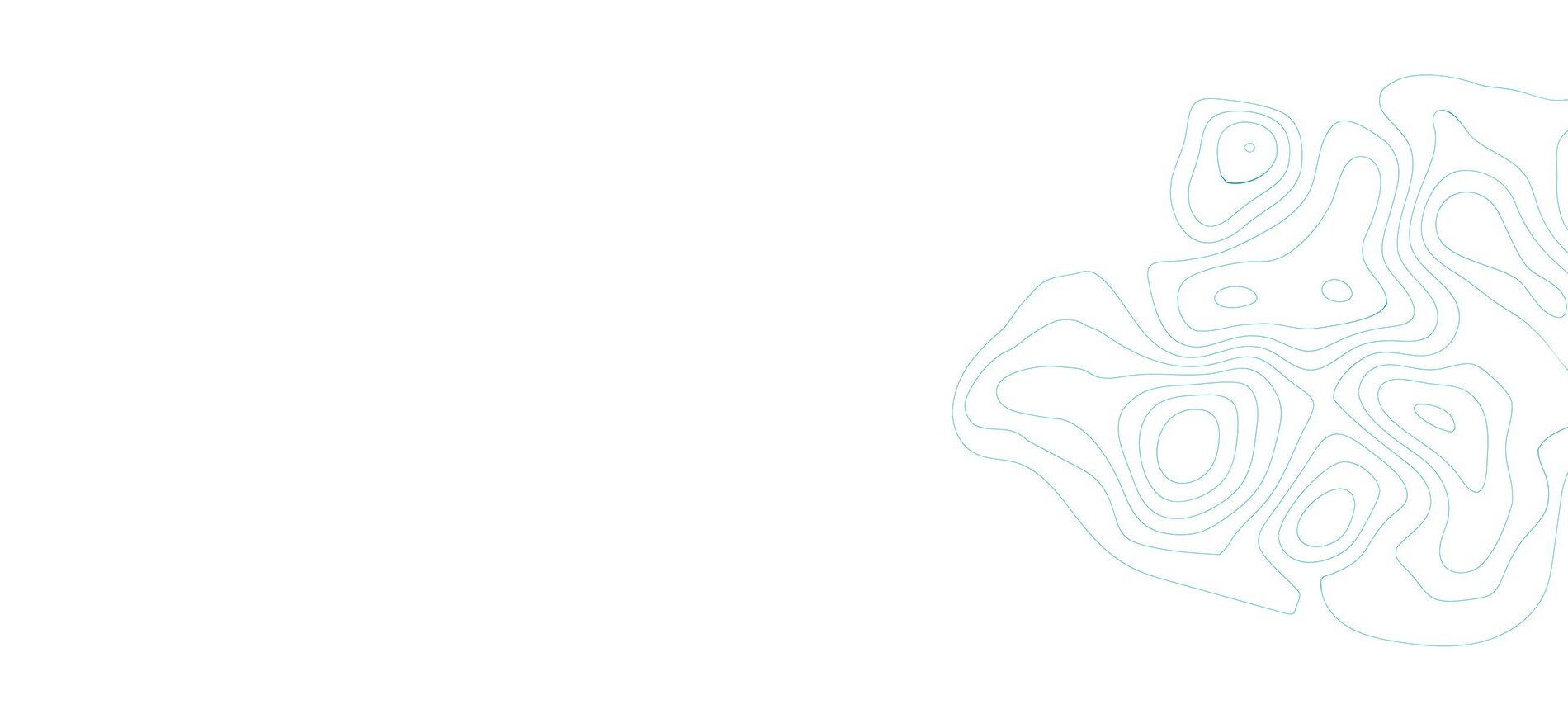
The old pattern was a bit cliché and juvenile for their target audience. I took inspiration from one of their California topographic maps of groundwater to create a new pattern as a reflection of their intelligence in their industry.


FONT & ICONOGRAPHY


